
Building a distinctive visual identity for a boutique French macaron brand
Client: Moonflower Macarons
Industry: Specialty Food / Confectionery
Services: Brand Identity • Logo Design • Packaging • Print Collateral • Digital Design • Website • Marketing Materials • Art Direction
The Challenge
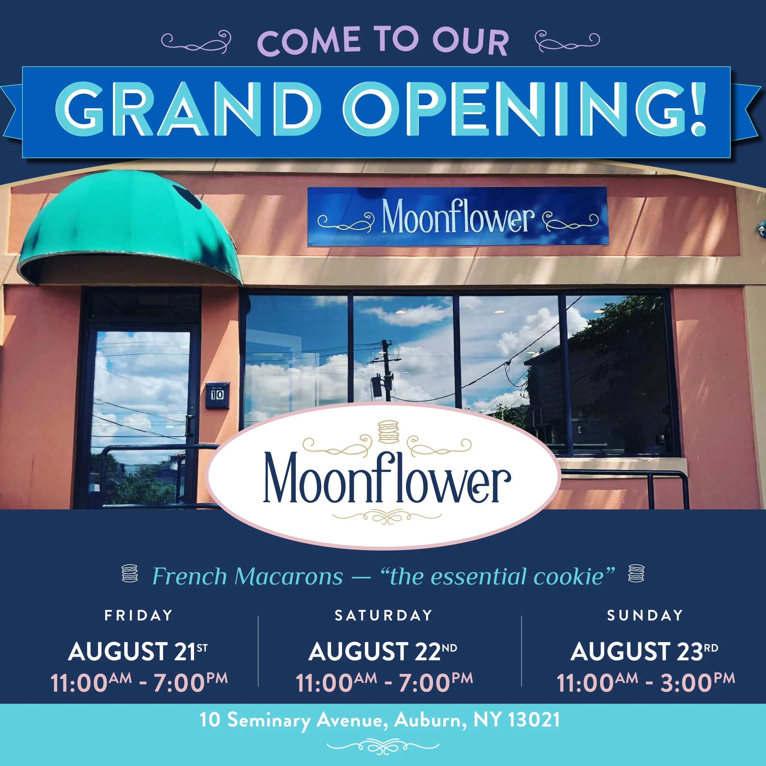
Moonflower Macarons is a specialty bakery in Auburn, New York, focused on handcrafted French macarons in whimsical and adventurous flavors. The business has been featured as part of the Finger Lakes Sweet Treat Trail, where it is described as offering French macarons made with local farm-fresh eggs.
The challenge was to create a brand identity that could communicate craft, creativity, sophistication, and personality—without allowing the visual system to become overly precious or feel like a generic bakery brand.
The product itself provided the strongest creative asset: hundreds of colorful macarons in an almost jewel-like range of colors and flavors.
The opportunity was to turn that visual abundance into a recognizable brand system.
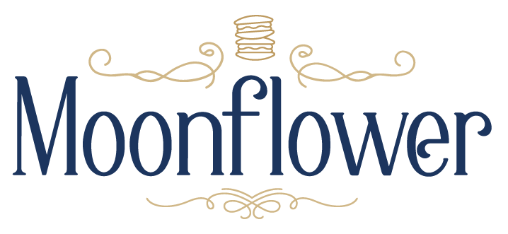
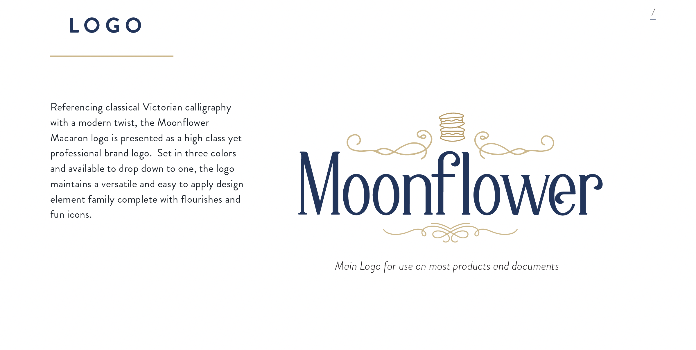
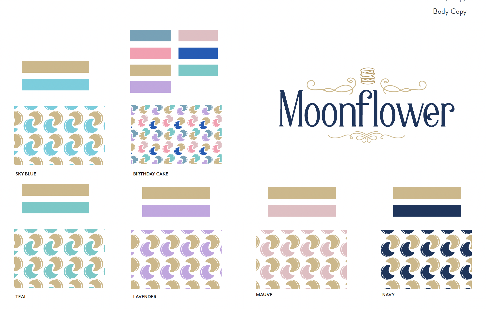
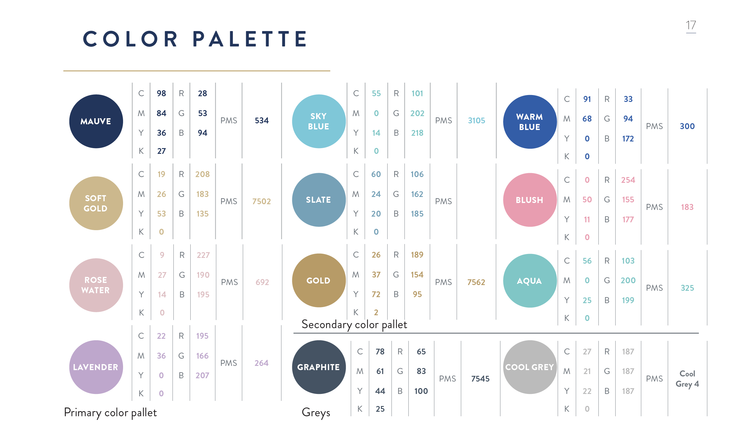
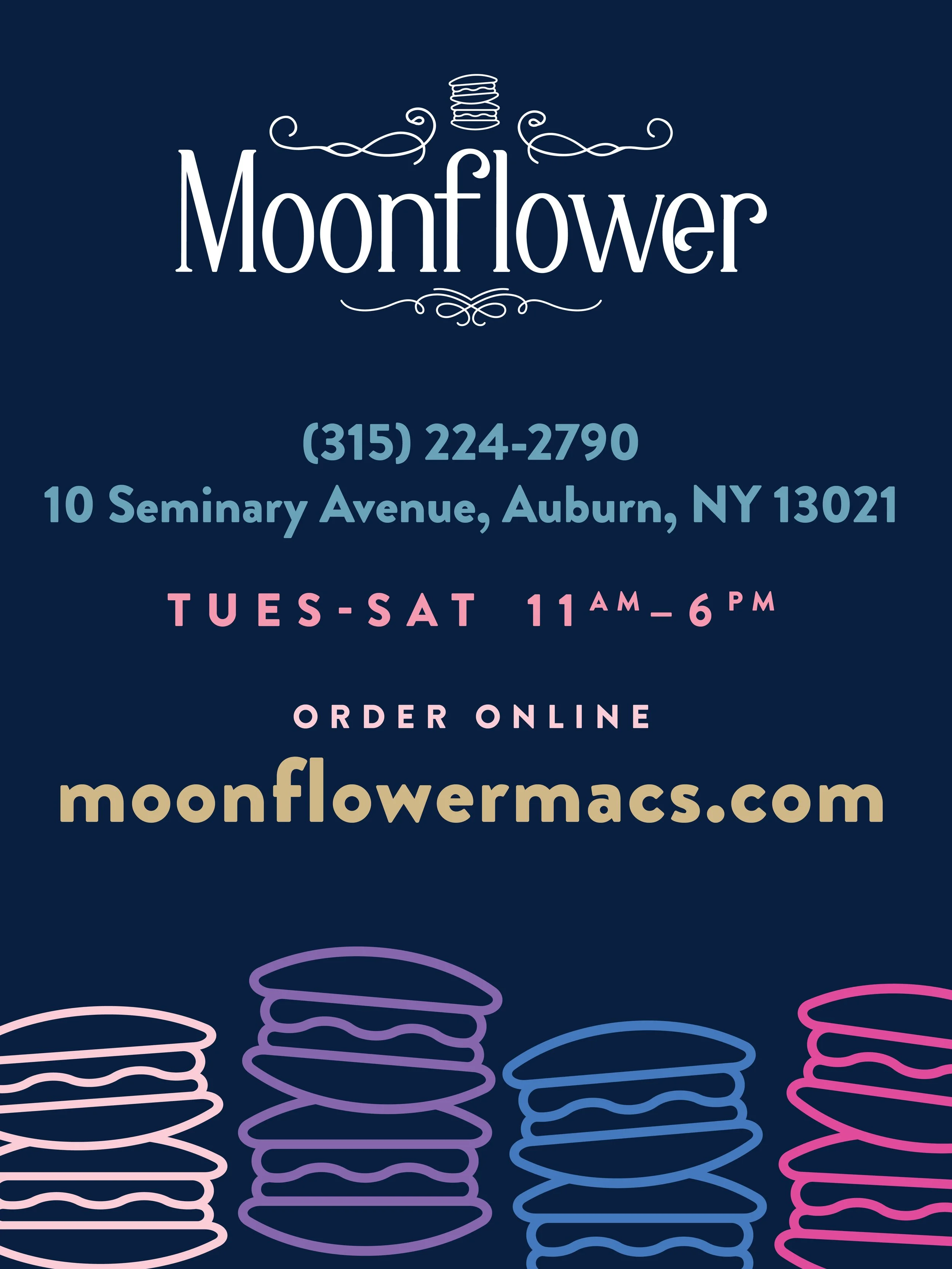
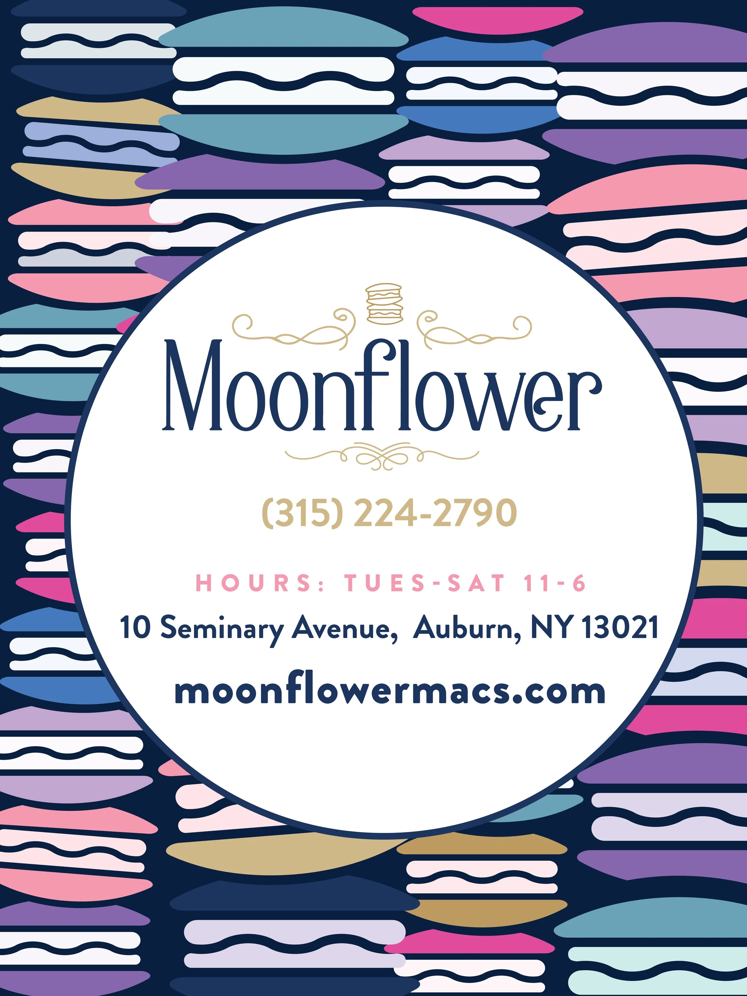
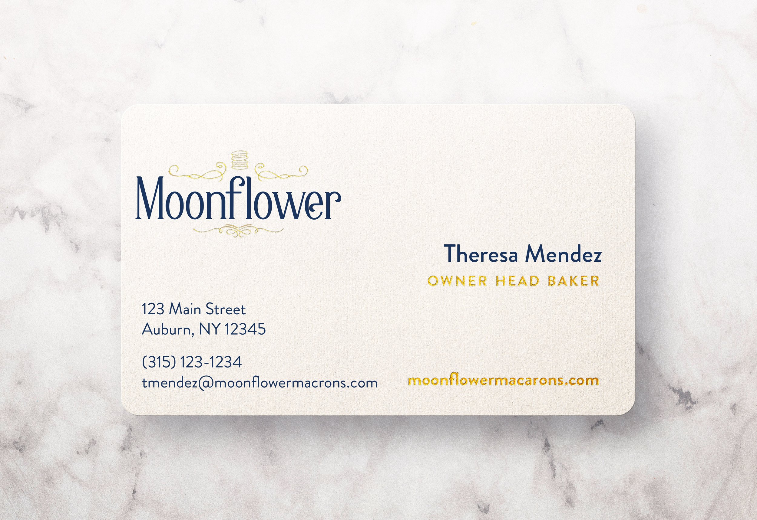
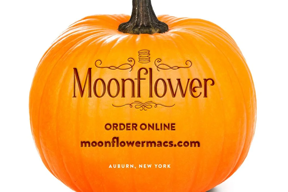
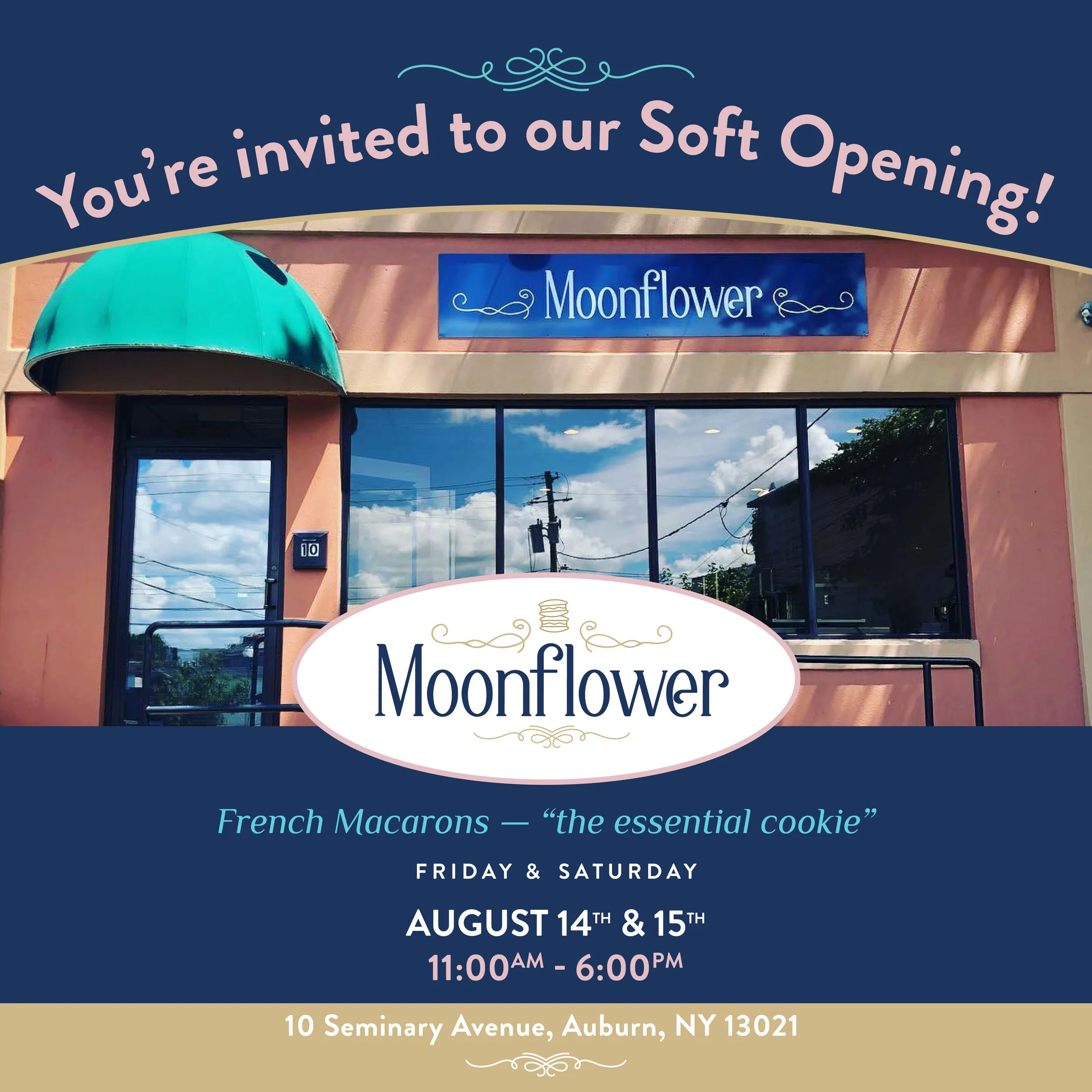
A logo married the two worlds of old and new into a clean, yet elegant mark. Additional design elements of flourishes and “mack stack” patterns give a well-rounded design identity, which creates a very beautiful brand identity. The overall brand invokes much more of a high-end and luxury brand as a much more sophisticated presentation. Gold filigree adds an extra layer of luxury to the branding.
★★★★★ “Martha's design work has been spot on from start to finish. She patiently listened to my ideas and worked them into a variety of images and concepts for me to choose from; it was difficult to pick from her beautifully crafted designs. From business cards to web design to marketing materials and promotional products, Martha meticulously incorporated my vision into a polished, professional brand.
Her insight into small business start-ups has been invaluable. She understands the intricacies and importance of social and community networking and asked critical questions about my business that helped me to focus my concept and begin my business with confidence.
I highly recommend Martha's design services to anyone looking to define their newly created brand, update their resume or business cards, or to evolve their brand identity or marketing strategy.”
-THERESA MENDEZ, OWNER MOONFLOWER MACARONS
A major part of the project was creating a visual system capable of handling an unusually broad color range.
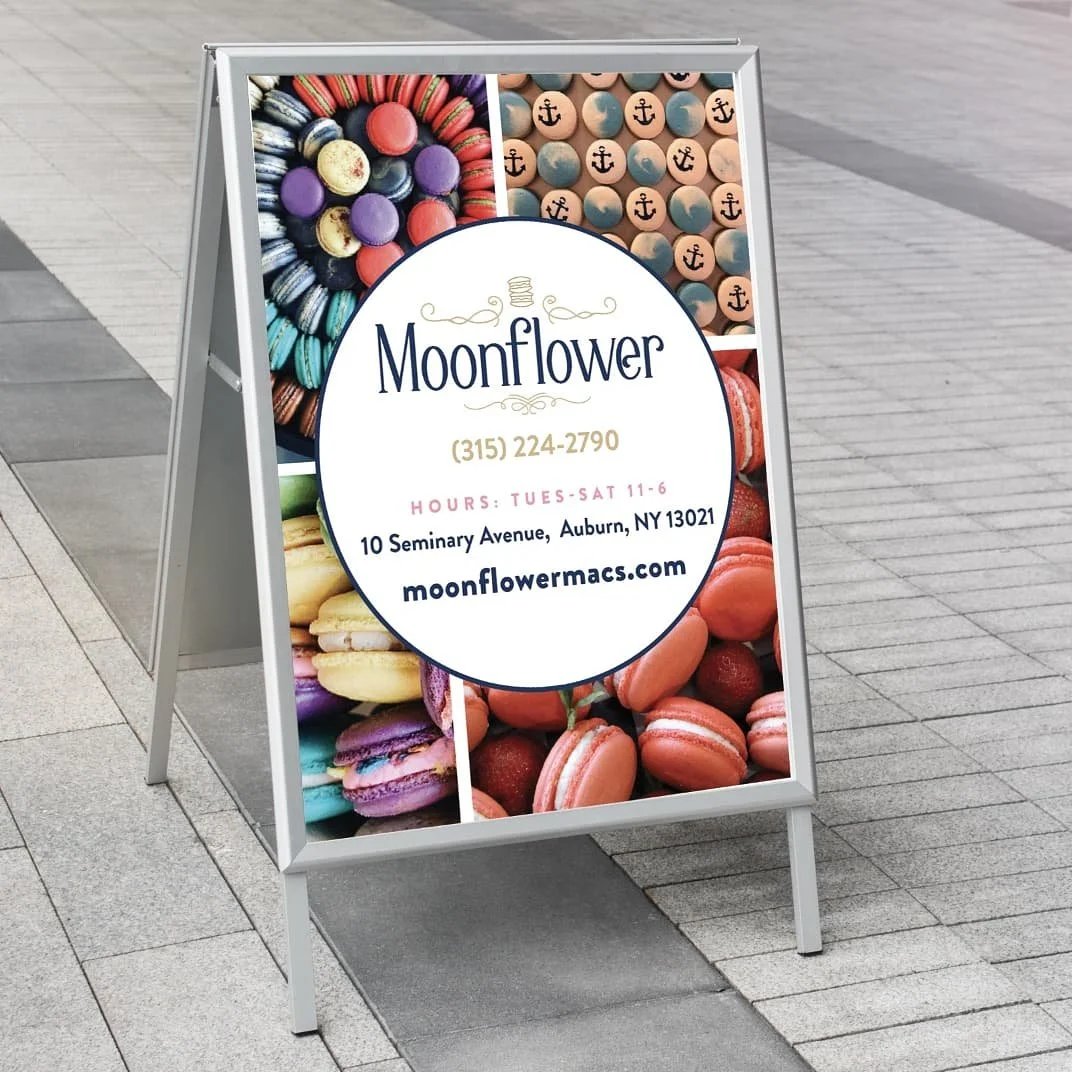
Instead of forcing every communication into a fixed color palette, the brand uses the macarons themselves as a dynamic color library.
Bright pinks, blues, yellows, greens, creams, oranges, and purples can appear within photography and patterns while the navy foundation keeps the overall system controlled.
This creates a useful art-direction principle:
The product brings the personality. The brand creates the consistency.
Packaging & Product Presentation
Packaging was treated as an extension of the brand—not simply a container for the product.
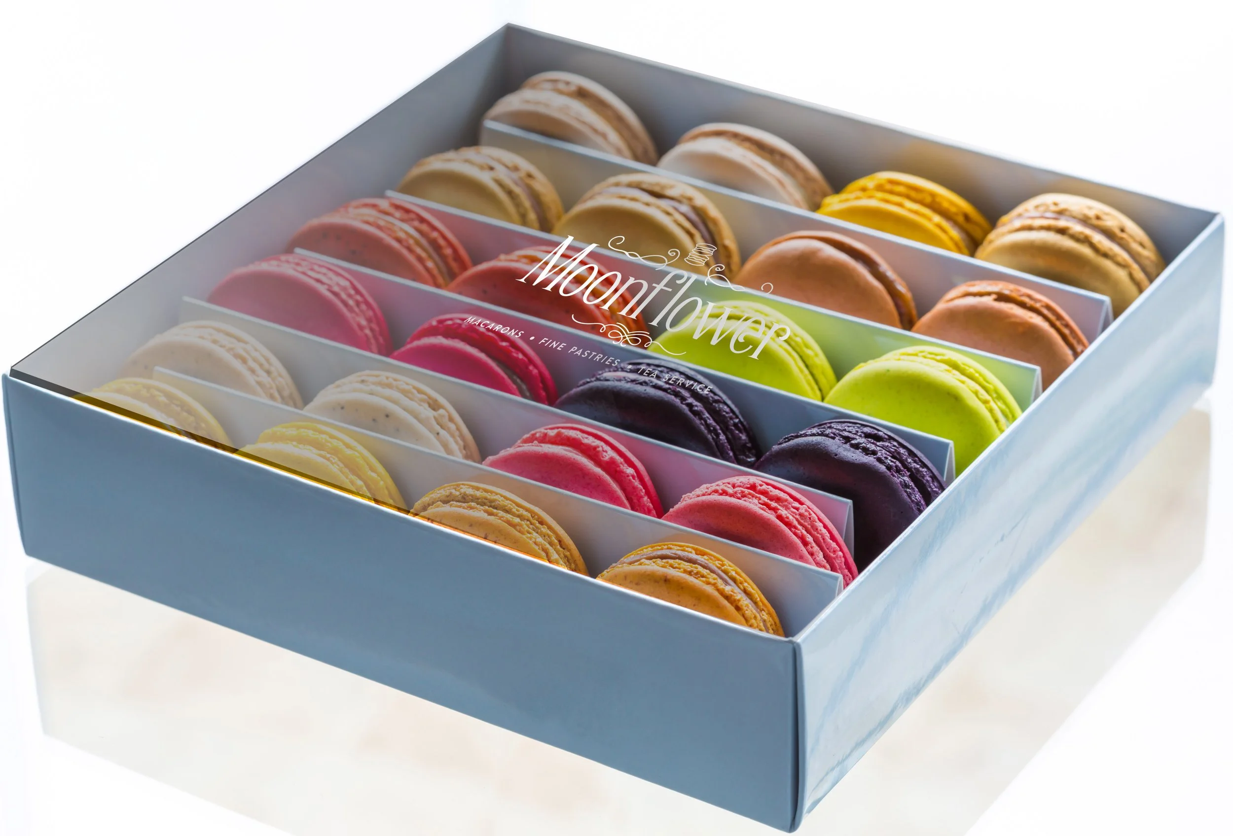
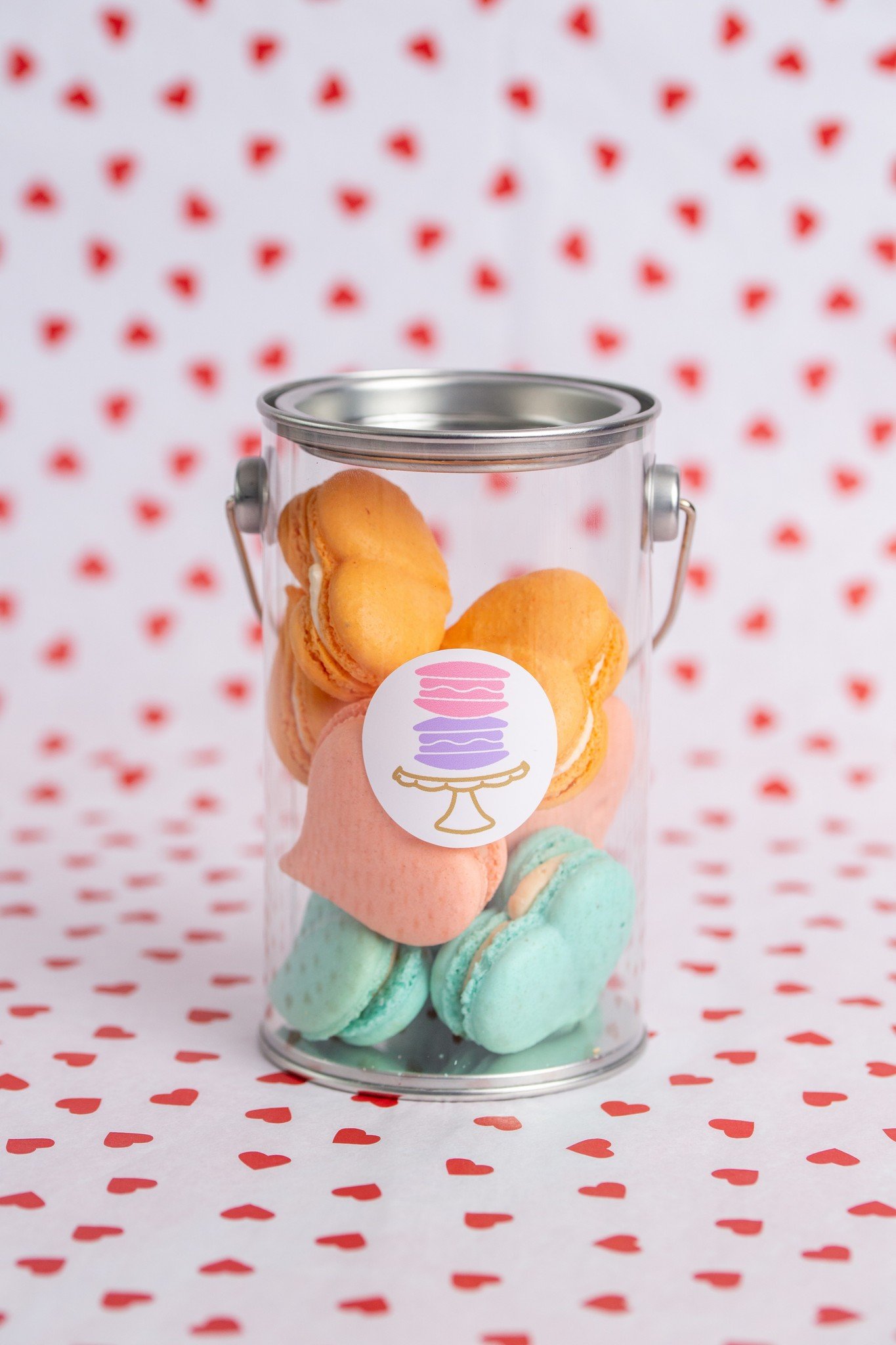
The system uses macaron photography, pattern, typography, and negative space to create a premium presentation while maintaining the approachable personality of the business.
The goal was to make the packaging feel giftable and memorable while ensuring the brand remained immediately identifiable.
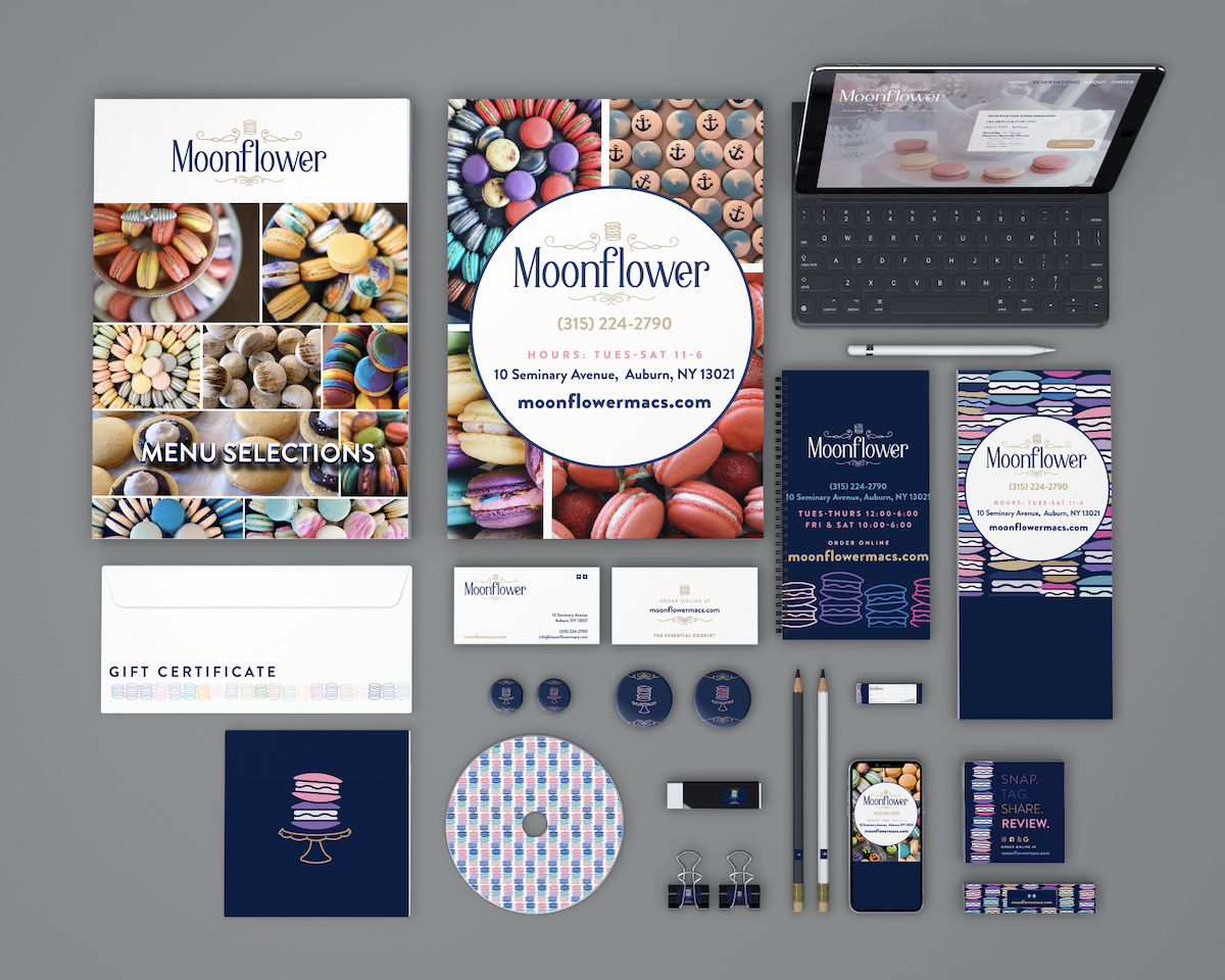
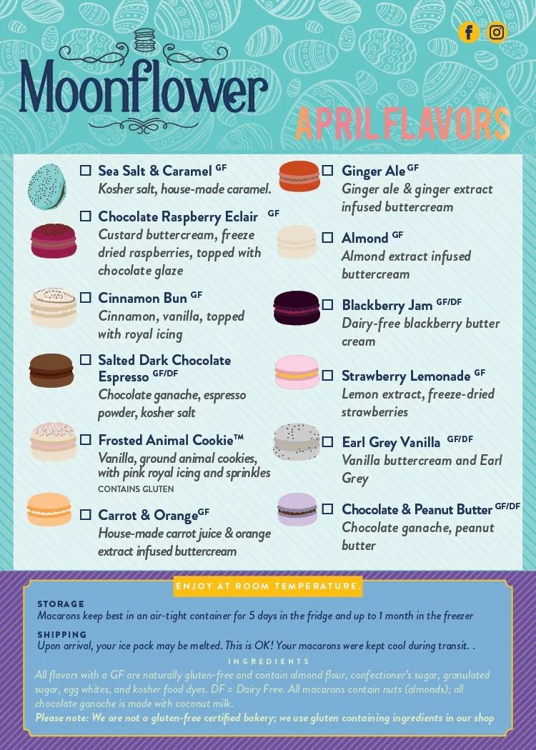
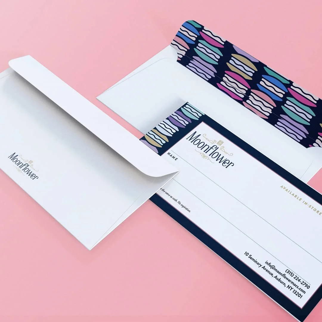
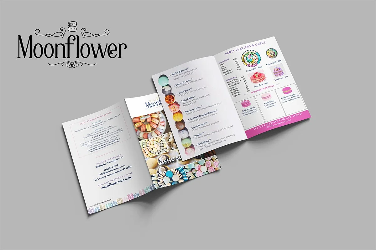
The resulting system supports both individual product communication and larger presentation pieces, including menus, promotional materials, and gift certificates.
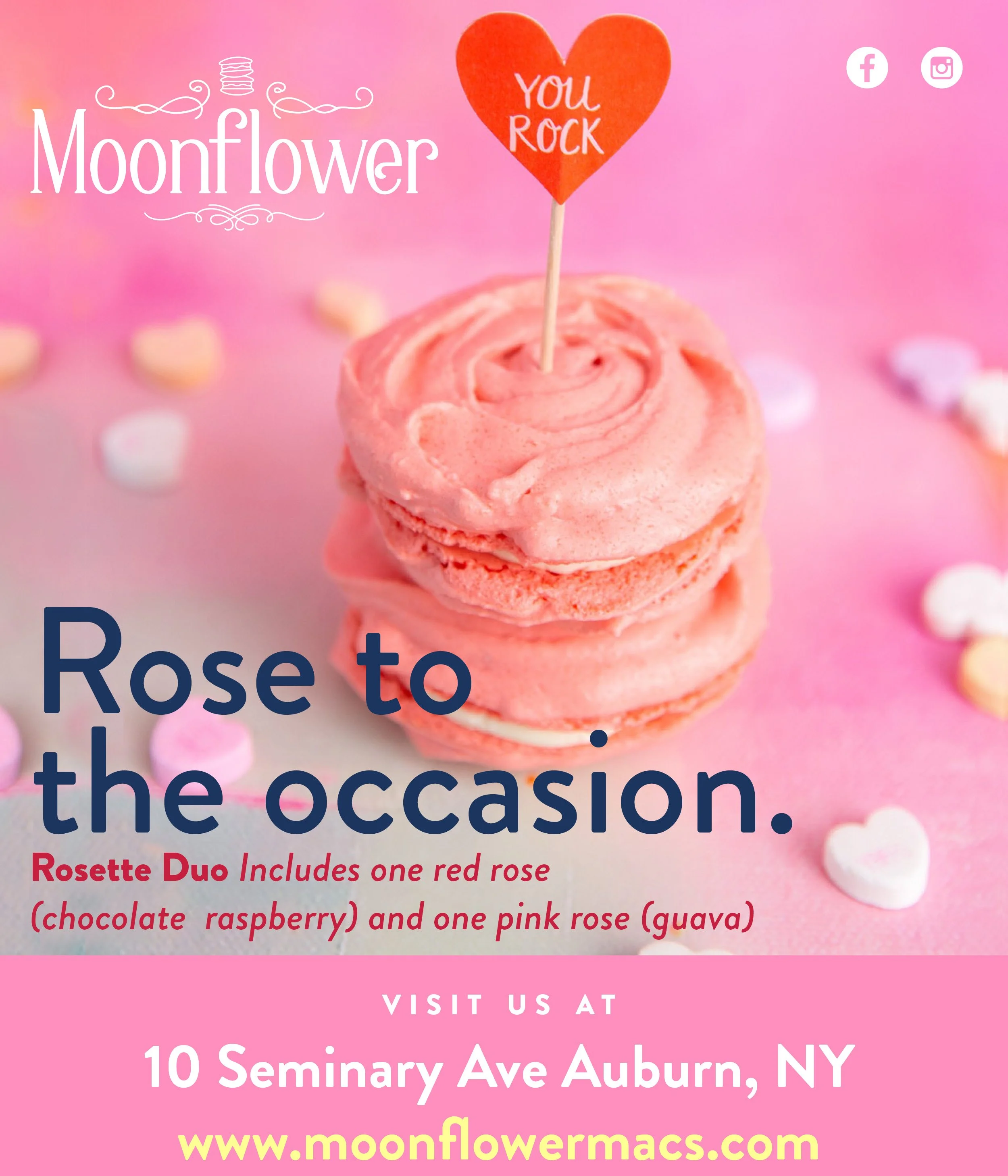
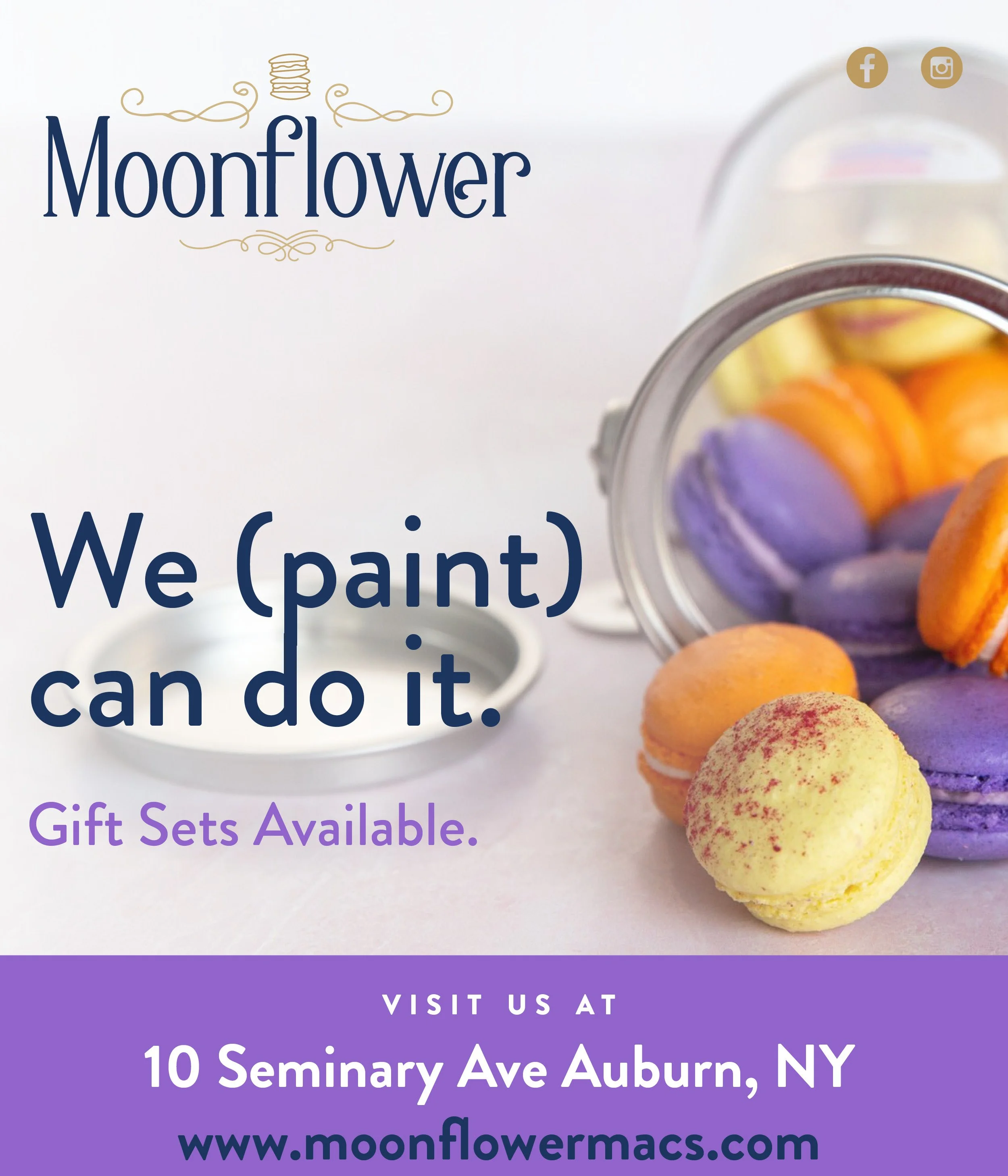
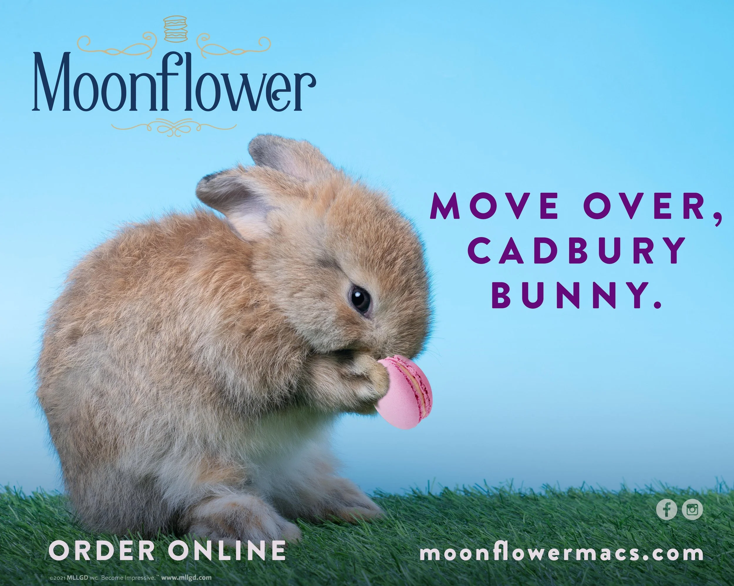
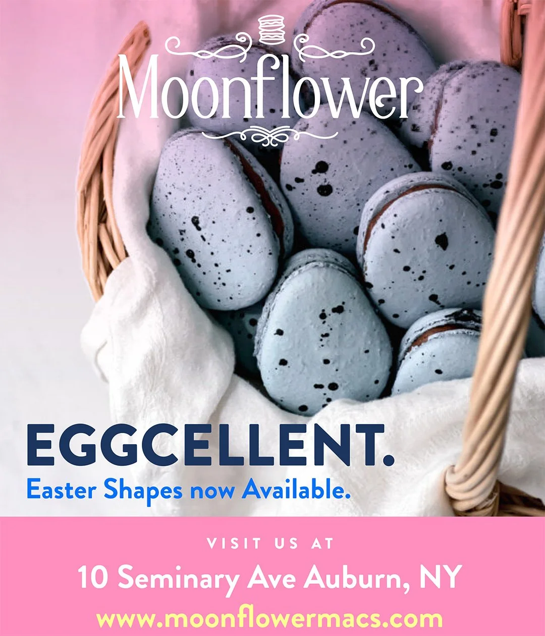
Digital & Social Ads
As time went on, I realized there was a disconnect between the audience and where we were trying to position the brand.
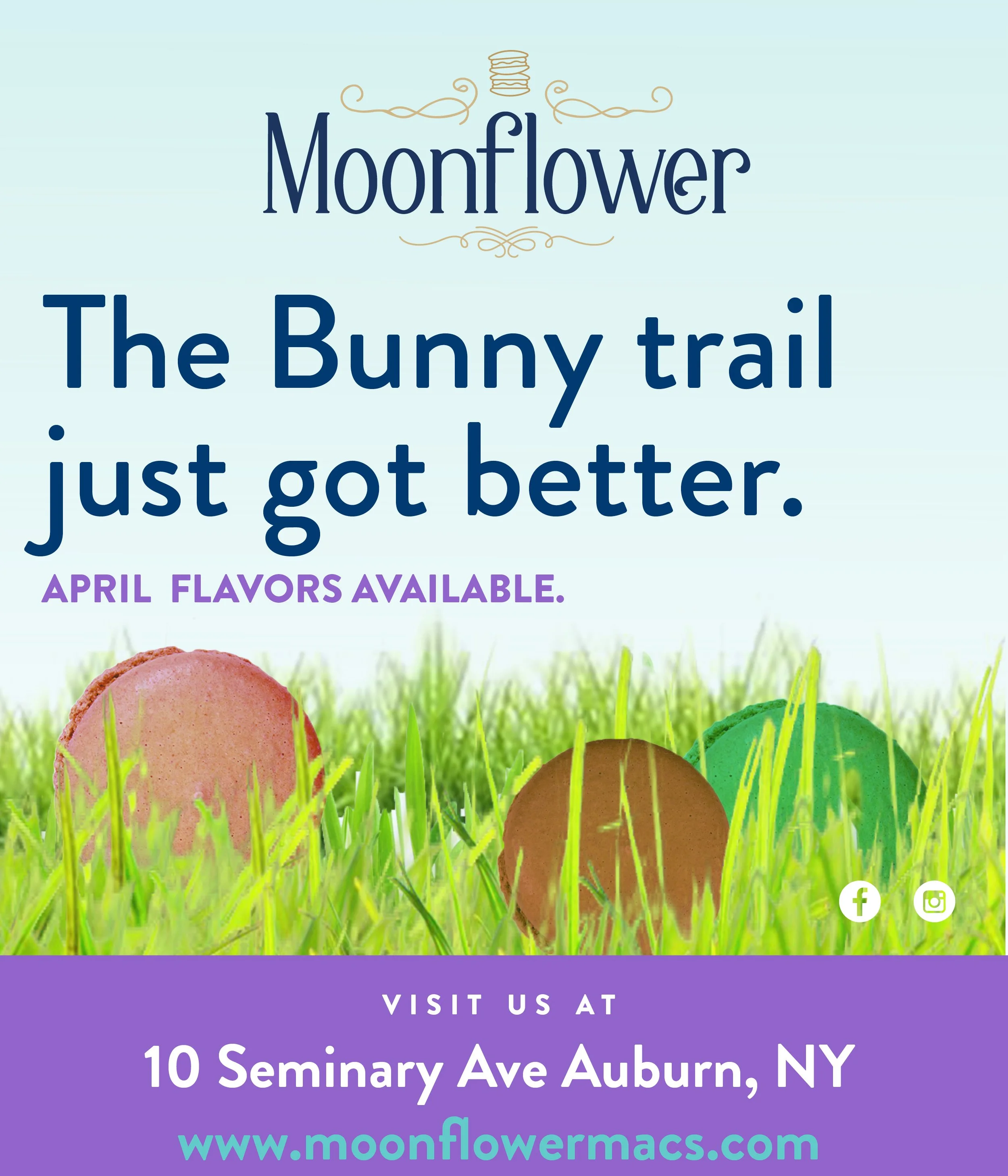
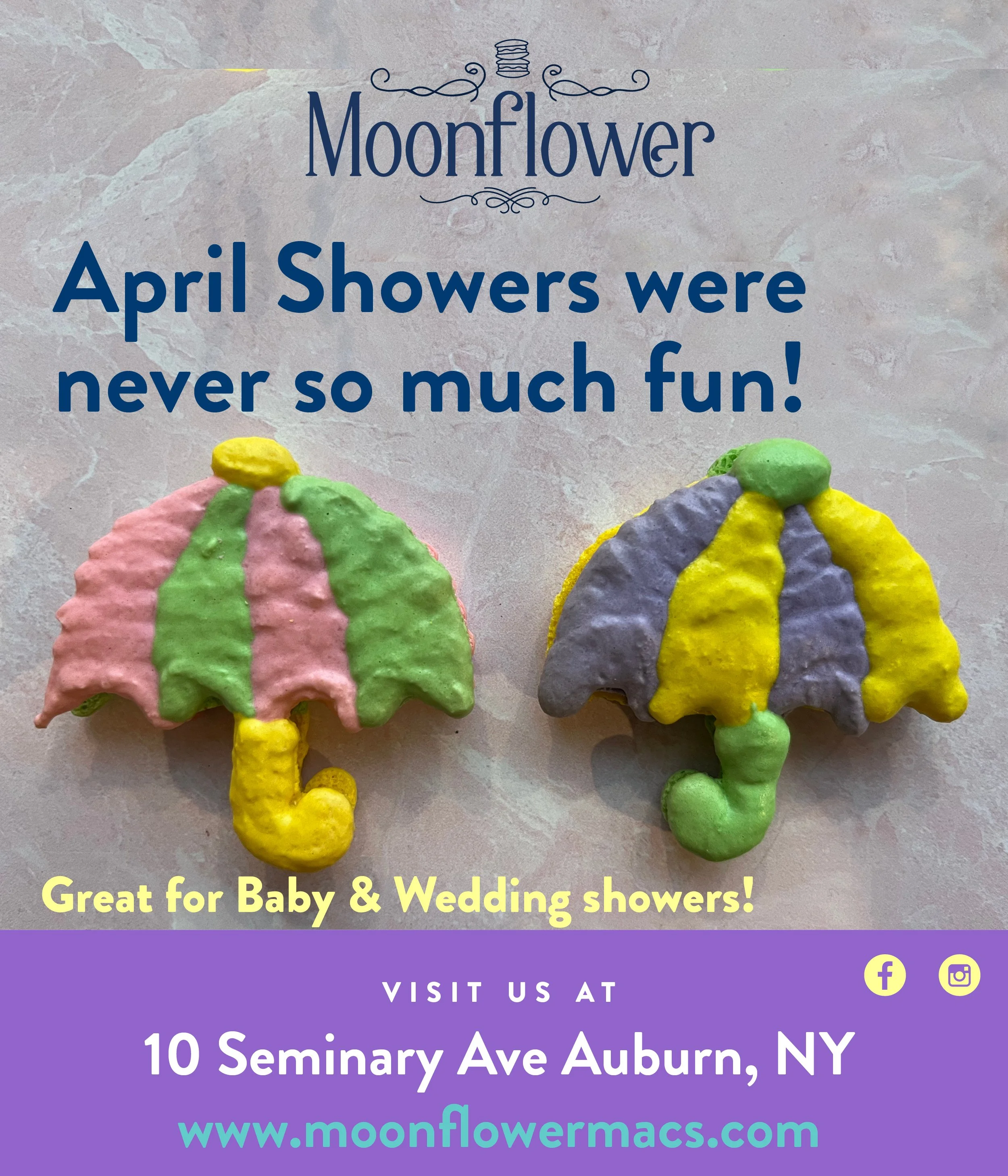
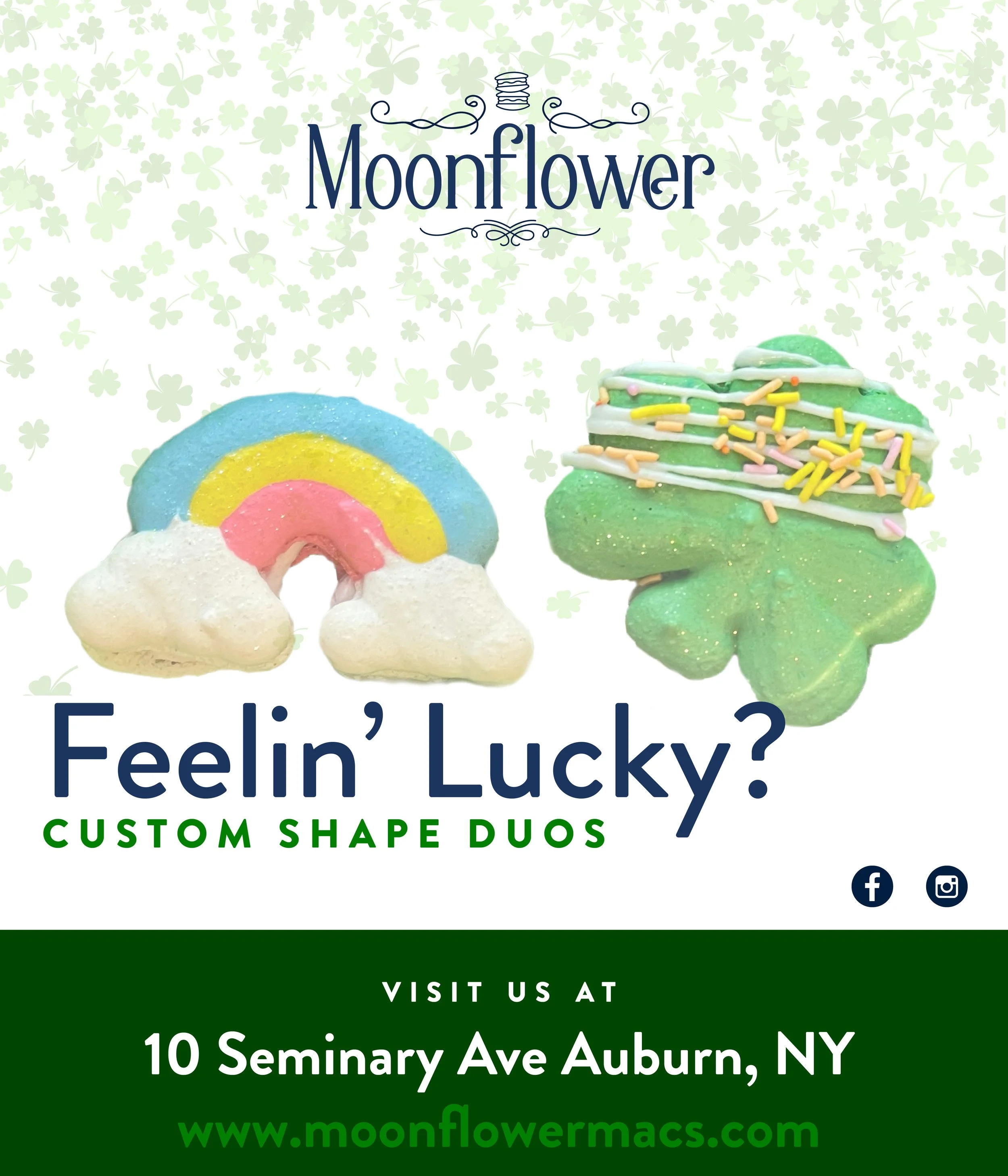
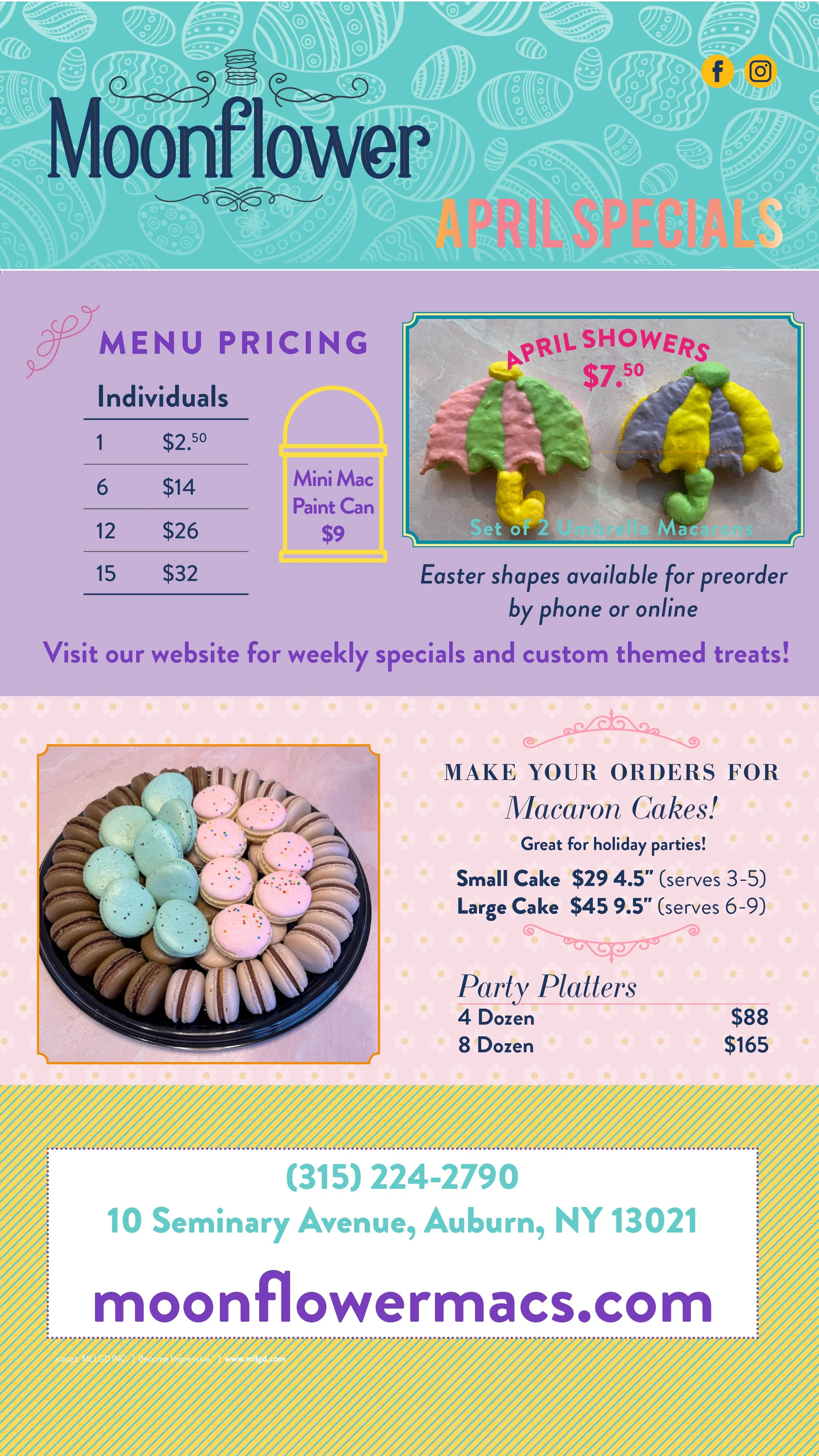
I wanted the brand to feel more accessible to the blue-collar community of Auburn, NY. While the overall positioning was in a luxury space, I wanted the Instagram campaigns to be a little bit cheeky and more fun.
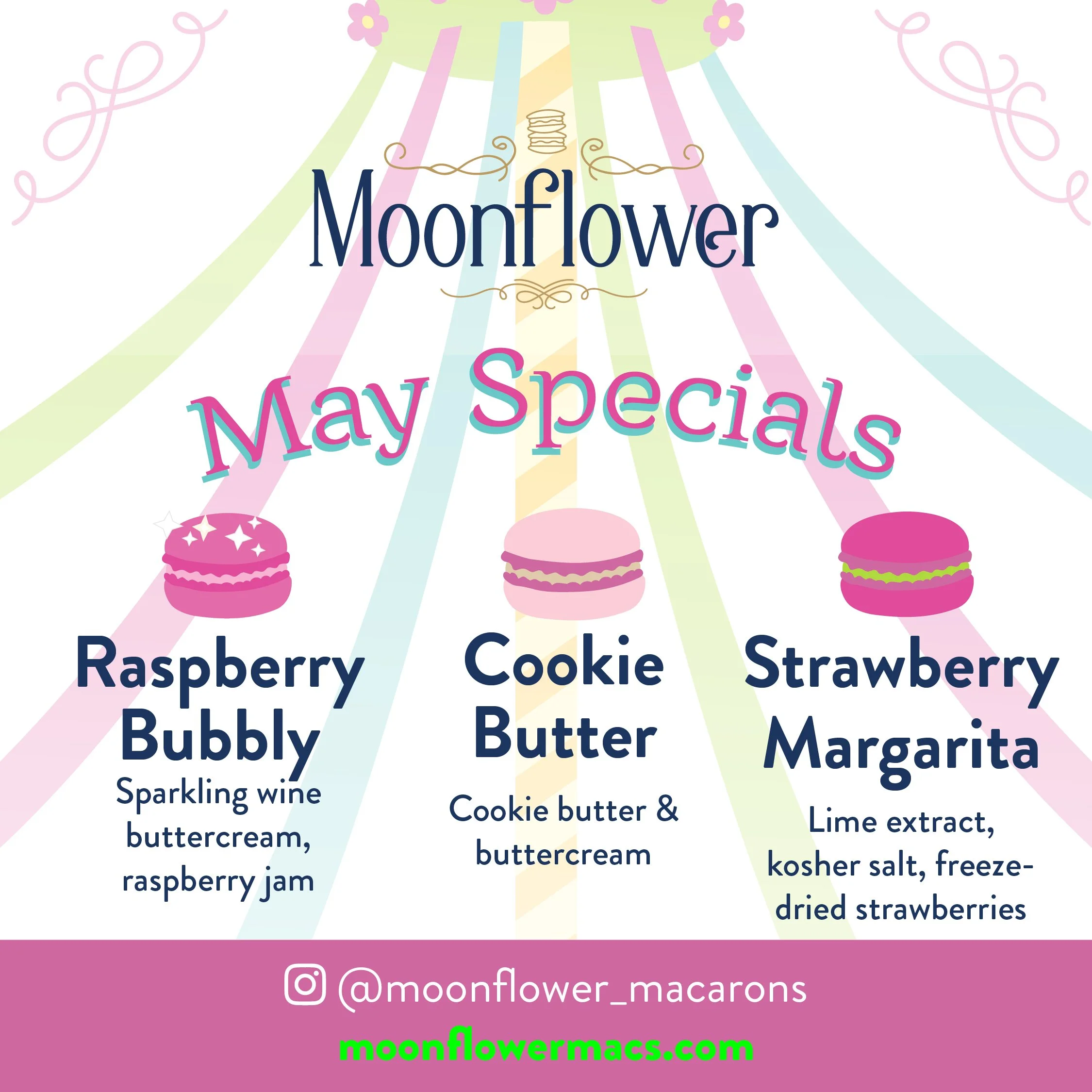
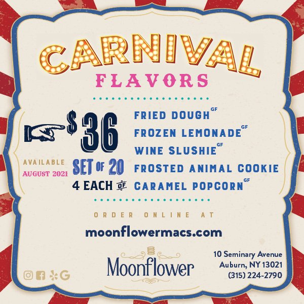
So naturally, I used corny but clever puns, and everyone loved them. Monthly flavor and shape specials made this especially enjoyable.
The broader brand materials
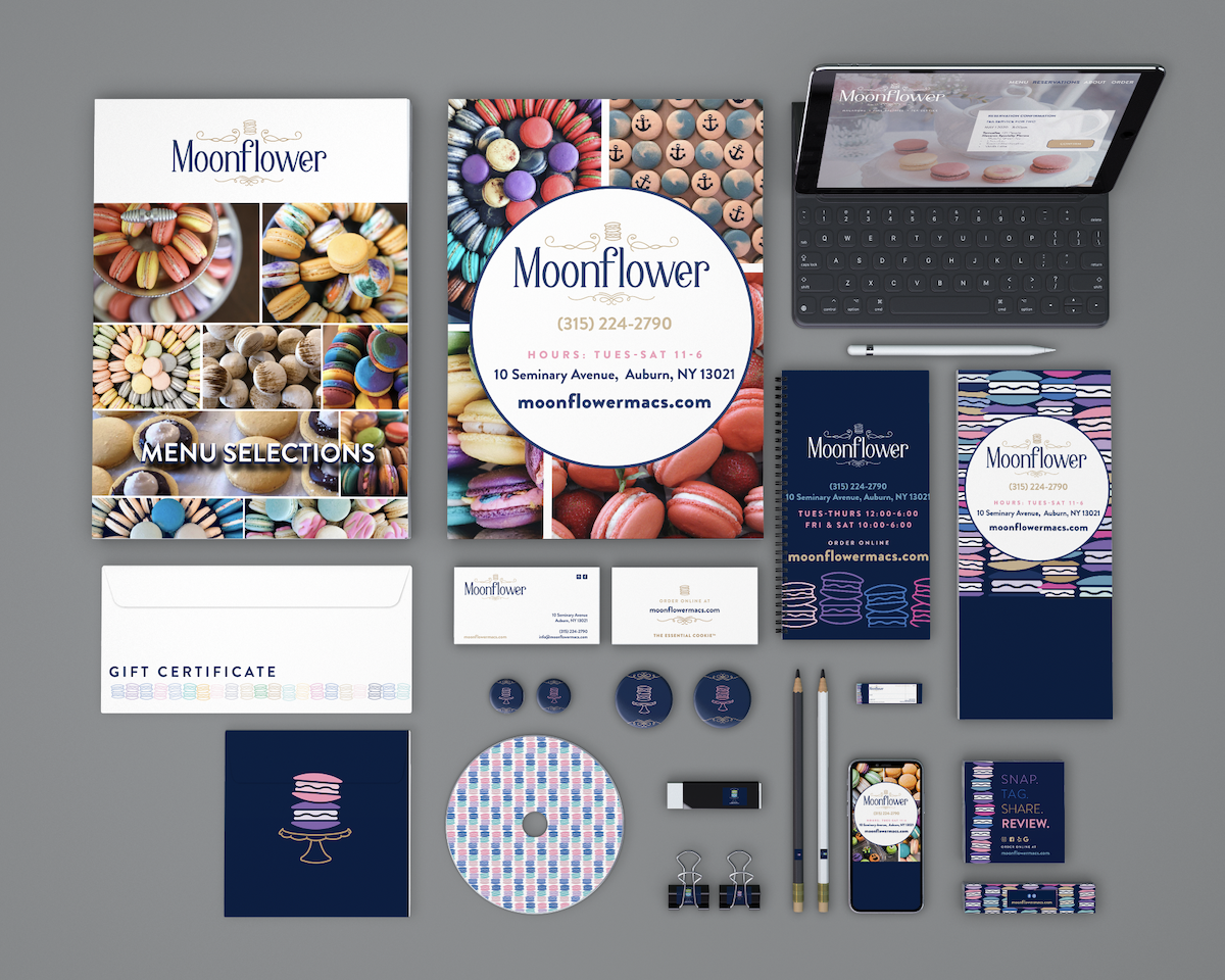
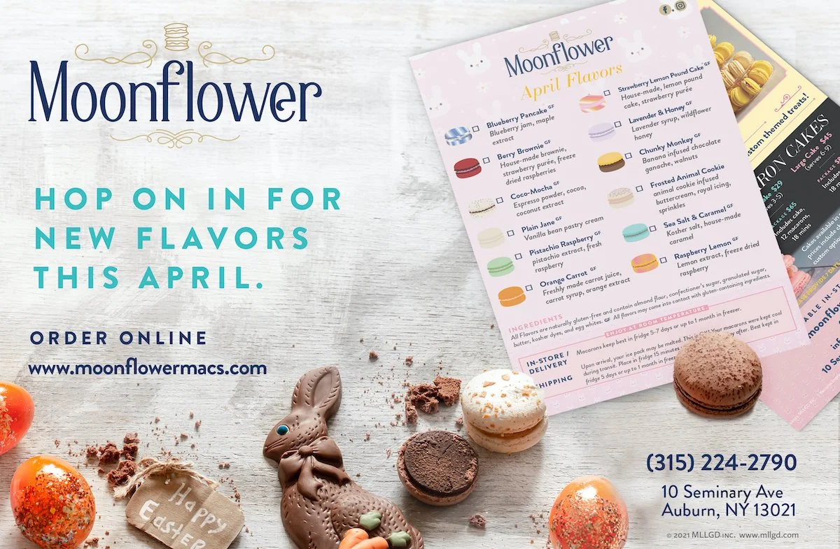
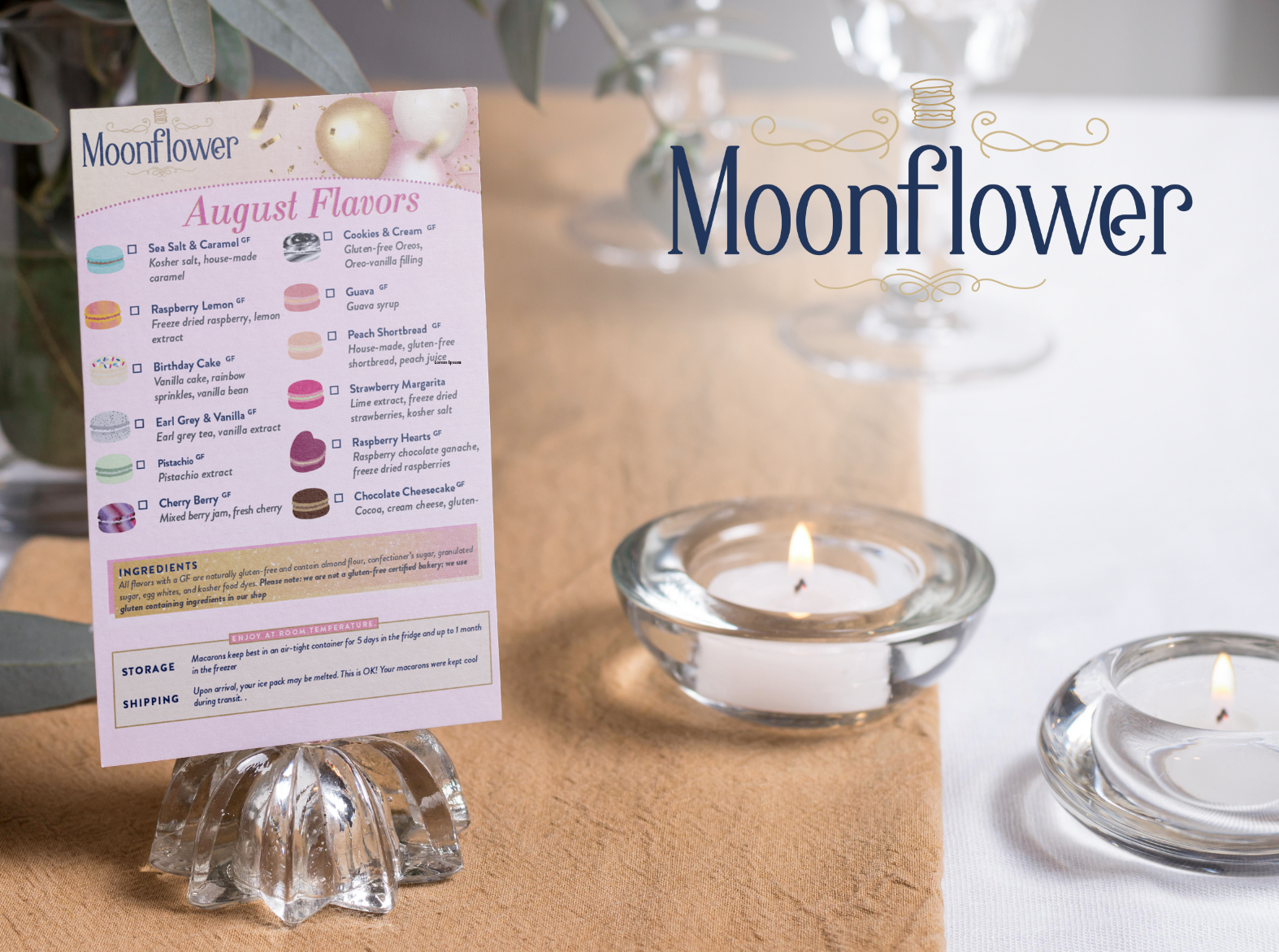
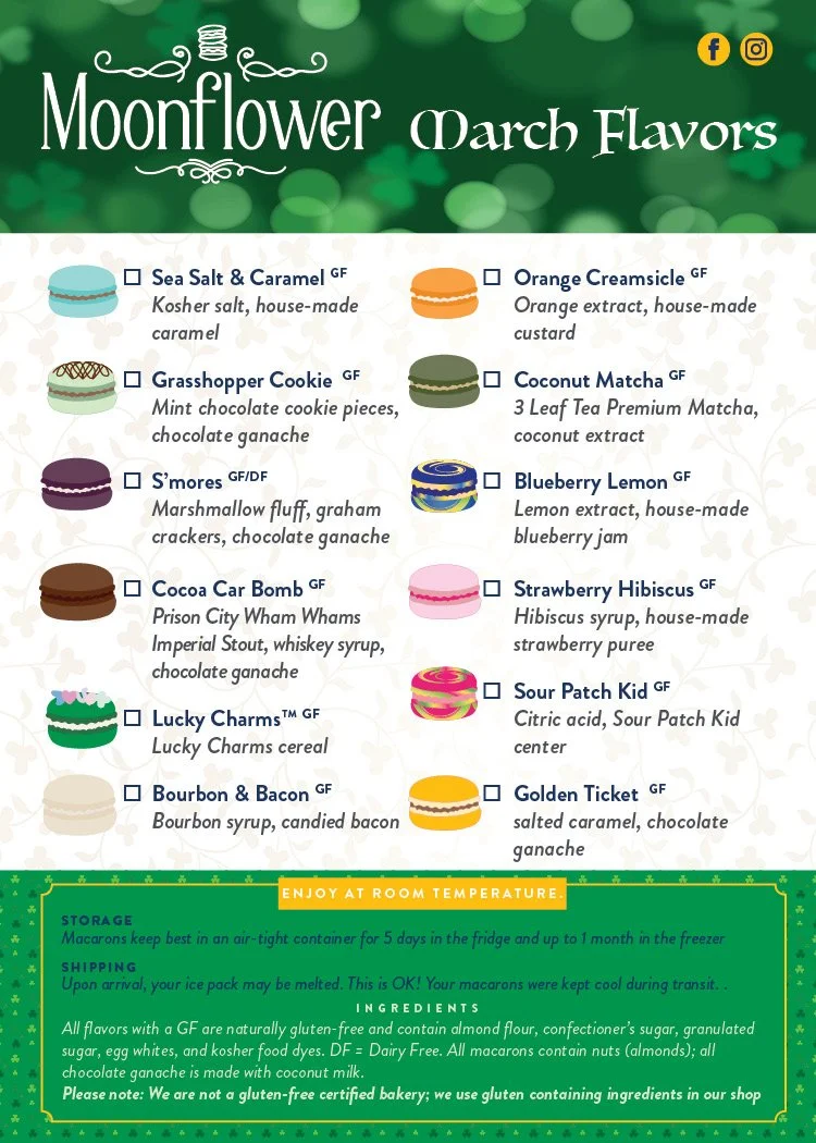
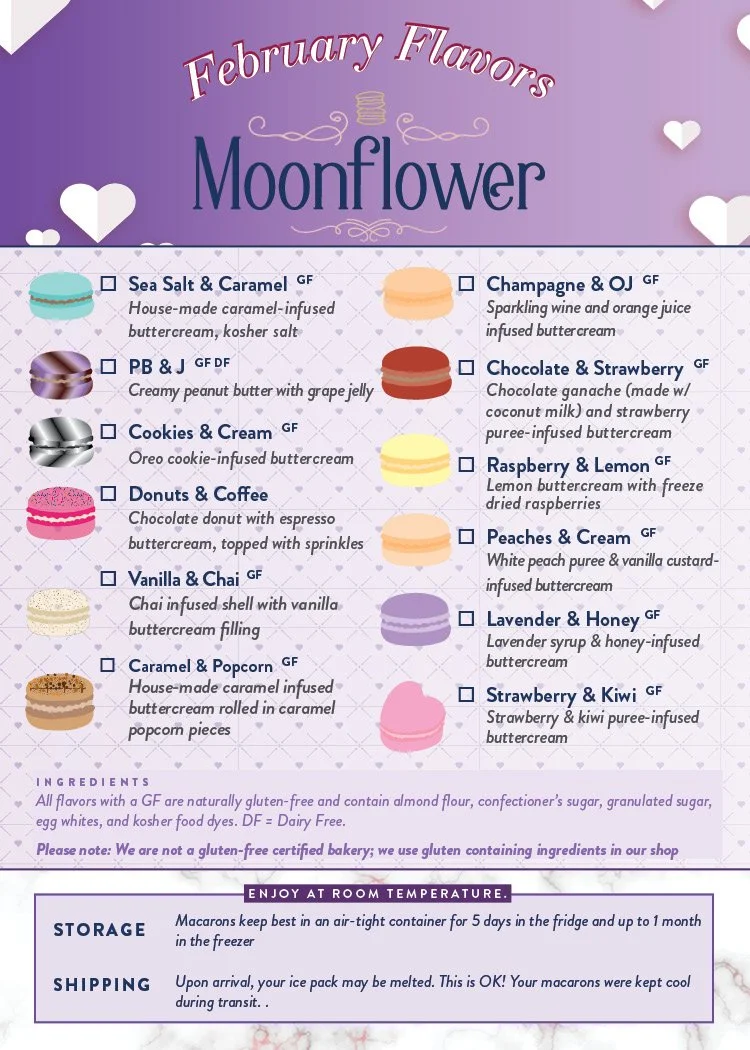
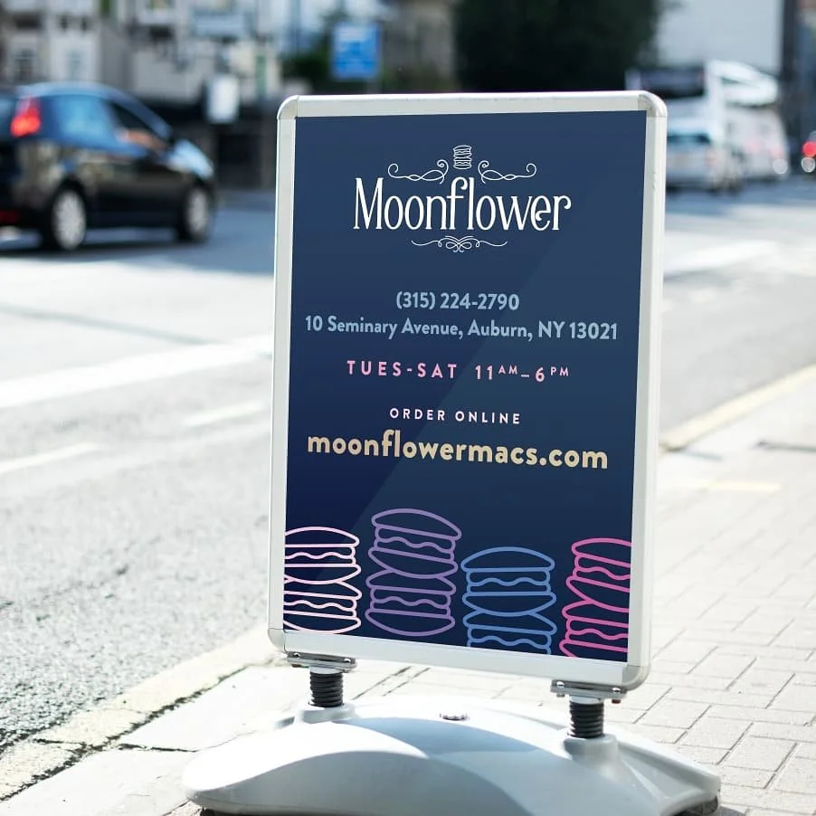
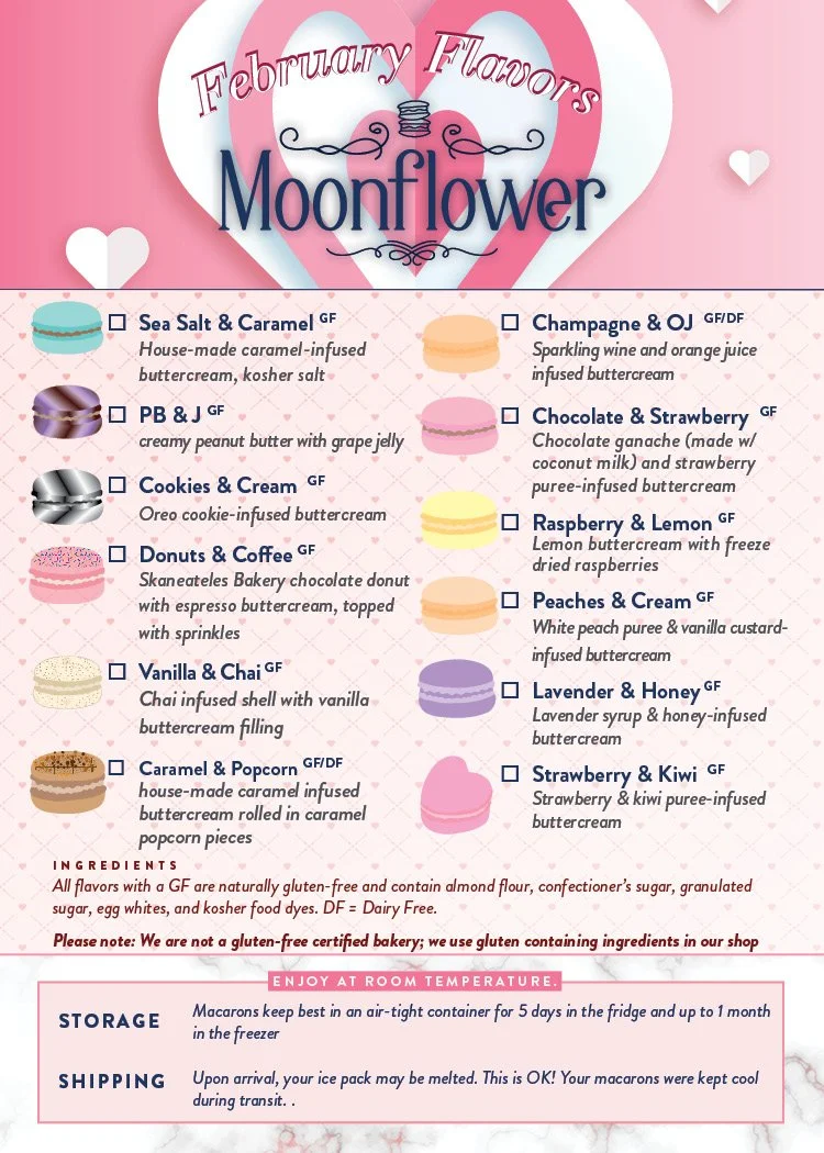
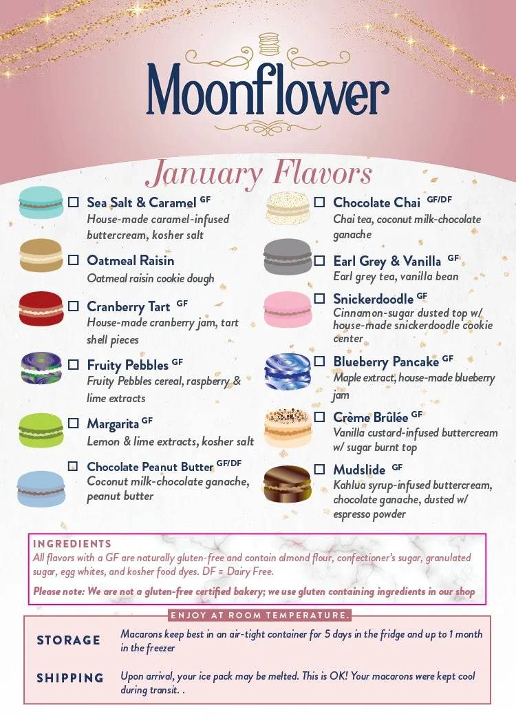
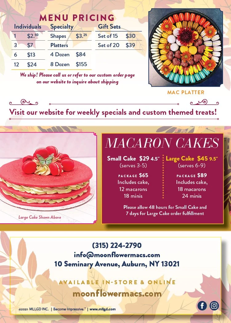
Monthly menus, marketing materials, promotions, and print collateral were all part of the overall scope. The identity was extended into a comprehensive collection of branded touchpoints, including:
Menu selections
Gift certificates
Business cards
Promotional cards
Stationery
Branded folders
Specialty print pieces
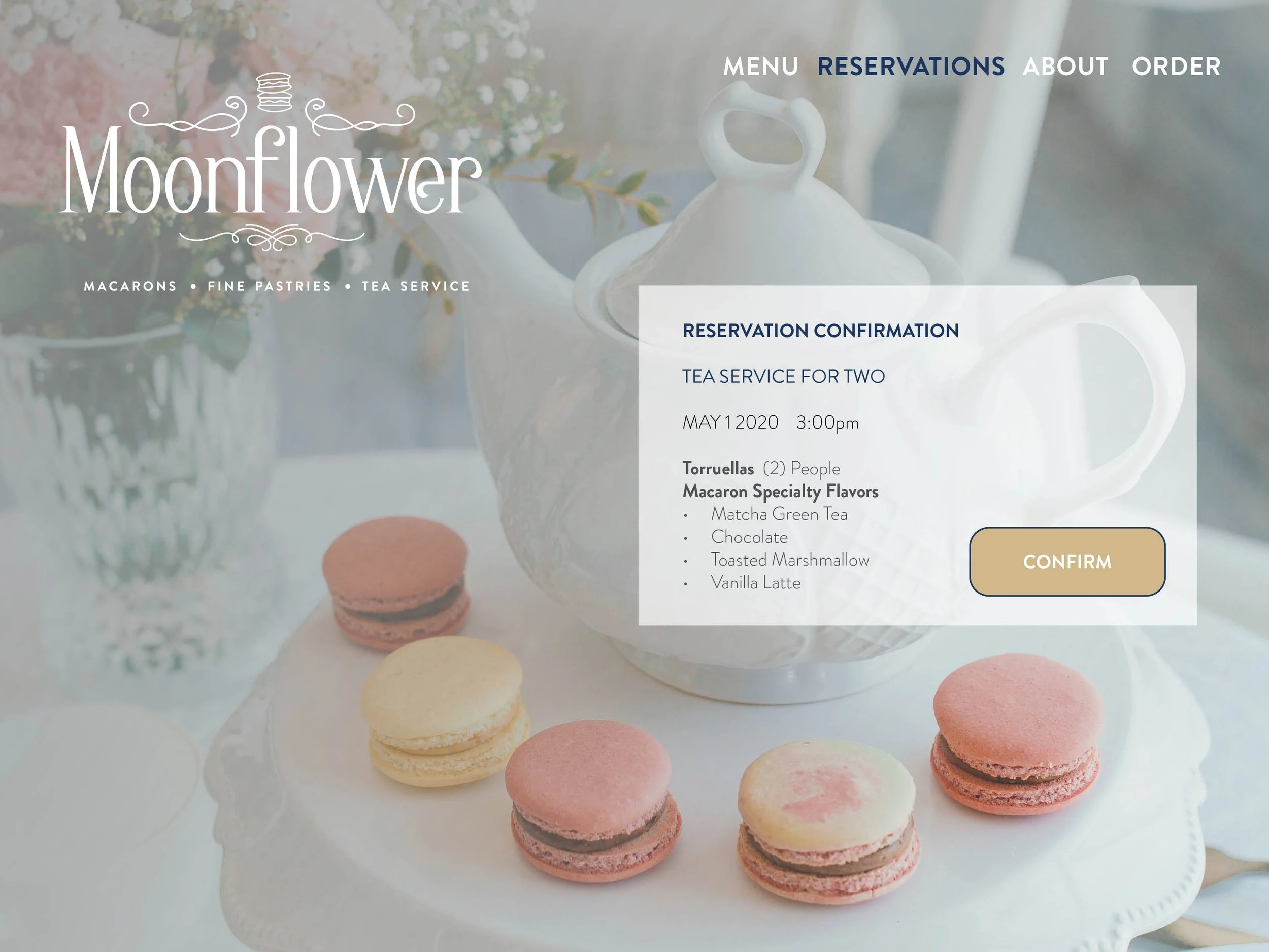
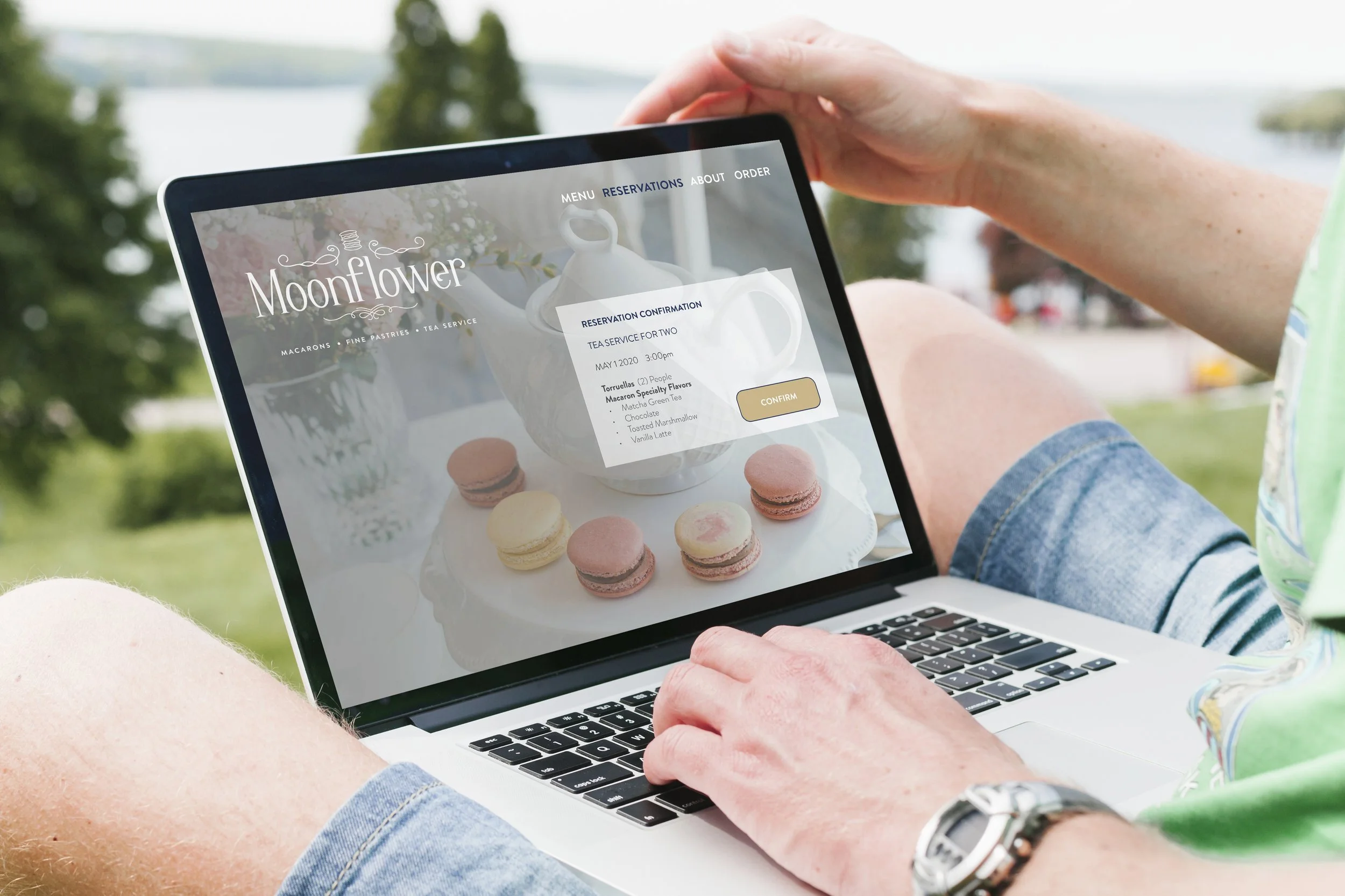
Landing Page
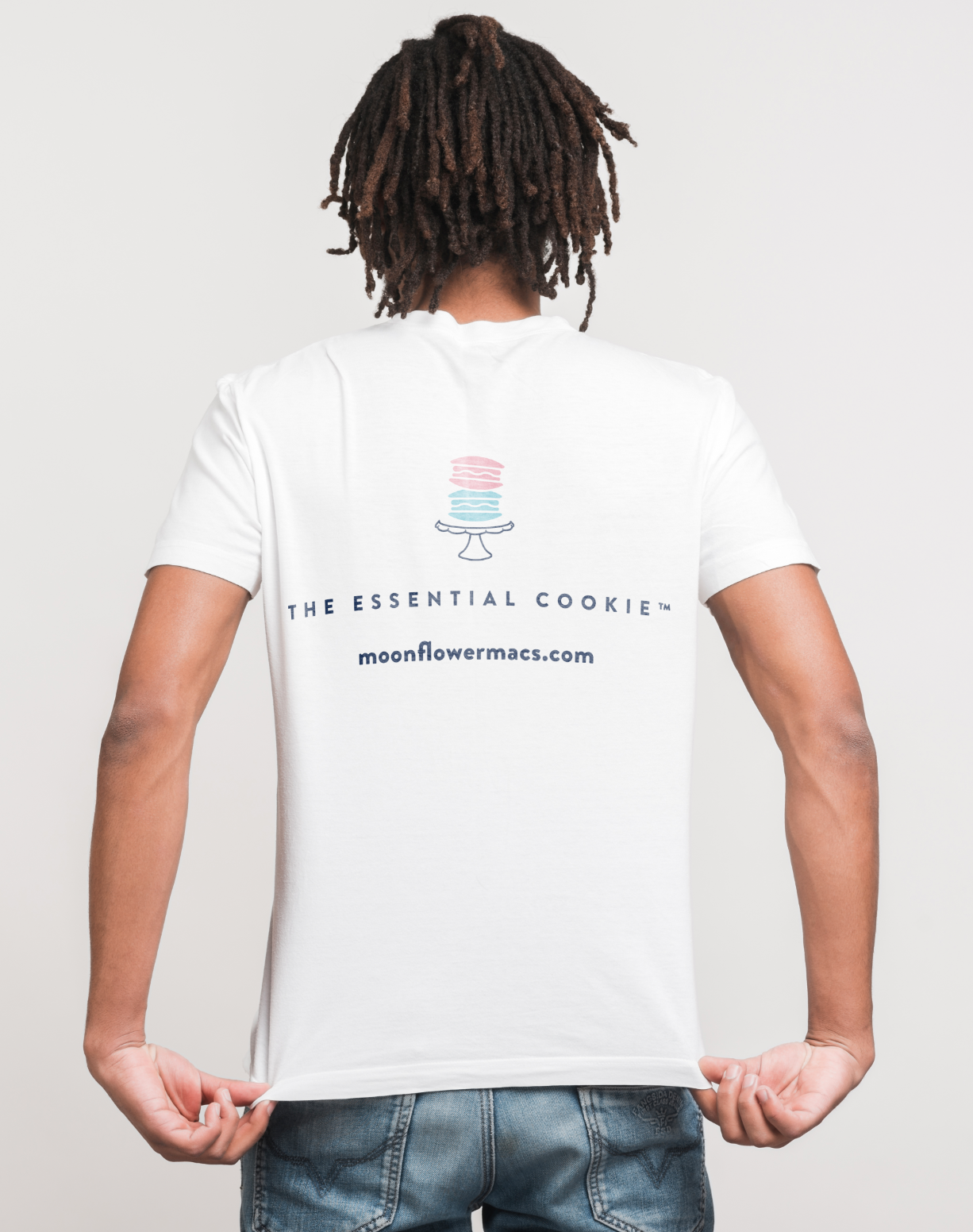
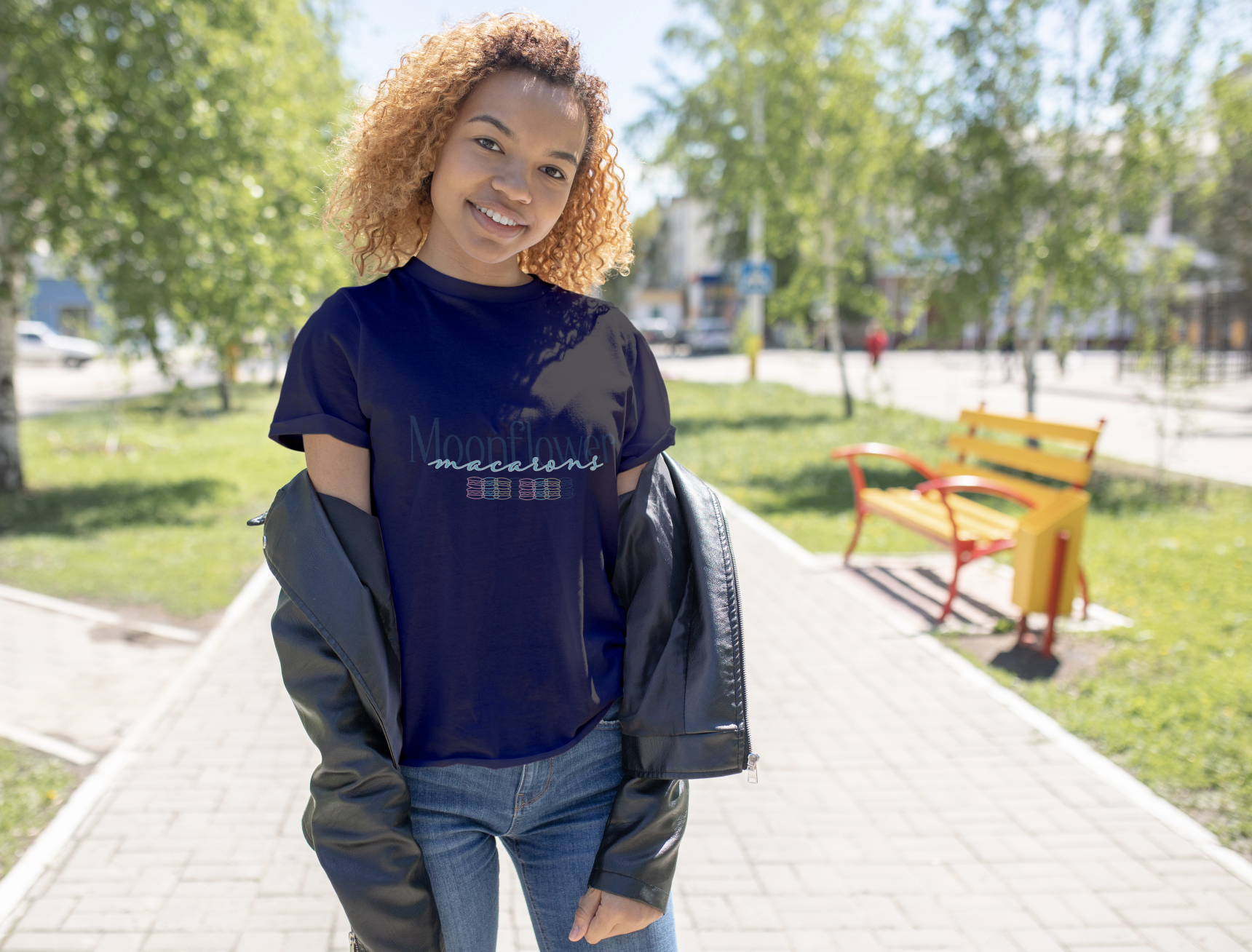
Promotional merchandise
Social media assets
Marketing collateral


KEY INSIGHTS
Directed brand identity development and creative positioning, translating the product’s artisanal qualities into a differentiated visual language designed to increase recognition and market appeal.
Developed six seasonal packaging concepts informed by customer taste-test feedback, aligning flavor launches with consumer preferences and promotional strategy, and contributing to a 25% increase in promotional-period sales.
Established brand standards and a comprehensive style guide, creating a scalable framework for typography, color, imagery, packaging, and digital applications.
Extended the visual identity across Instagram, Facebook, and other customer touchpoints, creating consistency across social and promotional communications.
Applied solution-based graphic design to business objectives, connecting brand expression, packaging strategy, customer feedback, and promotional campaigns to measurable commercial outcomes.